-
Discover the Apple Design Resources
Learn to bring your ideas to life with the Apple Design Resources. In this overview, we'll explore the resources Apple has to offer, show you how to access them, and share quick and helpful tips for new designers.
Resources
-
Search this video…
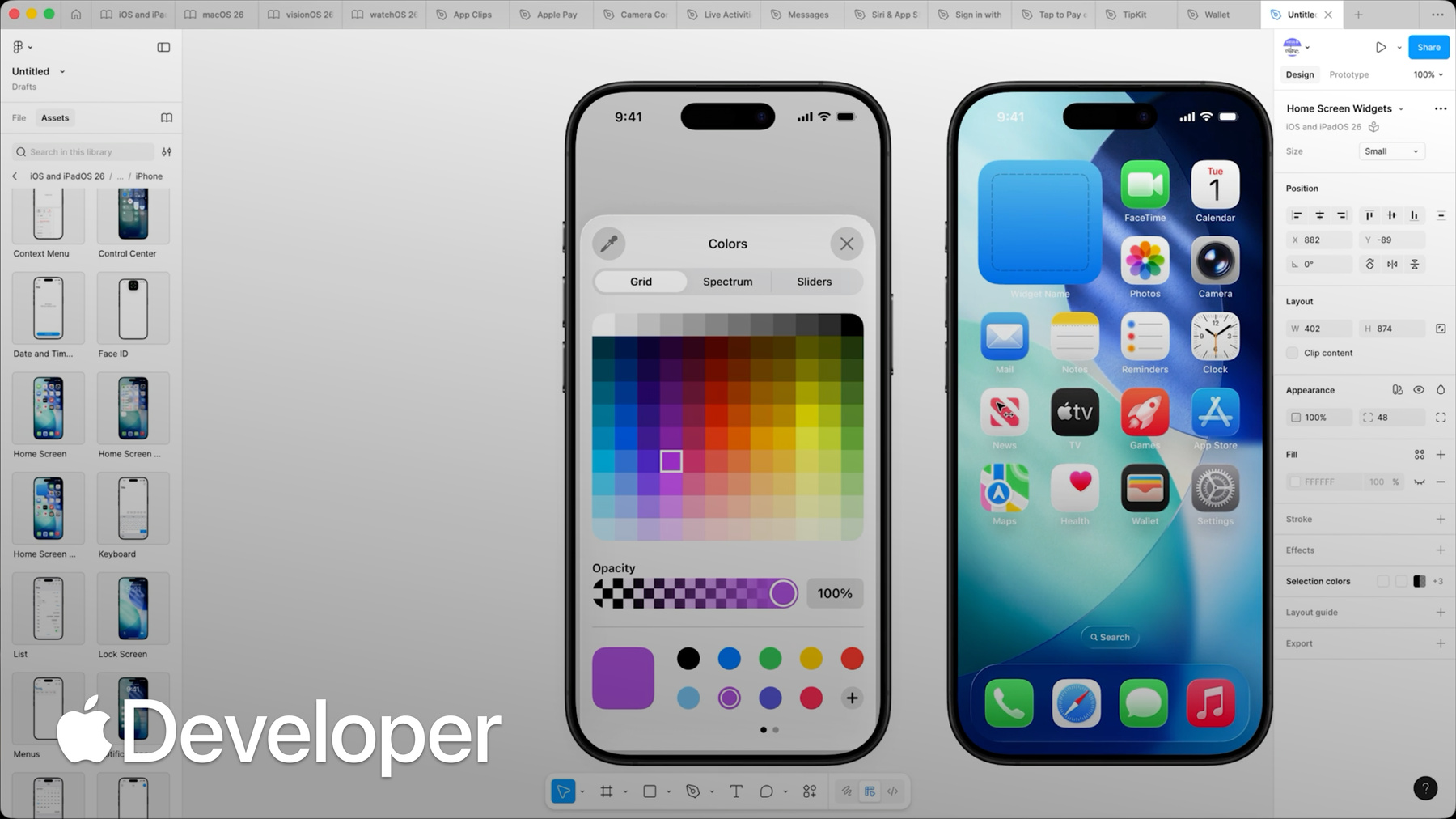
The Apple Design Resources are really a collection of different materials that we provide to people for designing apps. So that includes things like UI kits or design libraries that are made for Sketch or Figma, hardware bezels, so that you can put screenshots of your app inside of device frames and then use that to present your work. We also have tools like Icon Composer, and SF Symbols.
Our intention behind the design resources is to make it really easy for someone who wants to create an app to just grab these templates, grab these components, and really quickly put it into their design tool of choice. You have a degree of confidence that because it's coming from Apple, it's going to be really accurate to how things actually look when you build apps for our platforms. The hope is that it facilitates a healthier, clearer communication process between a product designer and an engineer who's building that app and that everyone is really literally speaking the same language.
I would say the first place you should go to check out the design resources is Apple’s developer website, which is developer.apple.com/design/resources There you’re going to find everything that we make available. If you’re a Figma user, there’s a couple of different ways that you can get our UI kits and our templates. One would just be to go to the asset panel directly within the Figma UI. And there you'll find all of our major platform libraries. And another great way to find everything that we provide for Figma users is to navigate over to the Apple Community page. And there you're going to see everything that we currently publish, including our platform UI kits, as well as all the technology templates that we share. If you're a Sketch user, finding our libraries is really easy. You just go to the settings for Sketch and go over to the library pane, which I have selected here, and you'll see all of the platform UI libraries that we provide. Loading one is as simple as just checking a checkbox.
One thing I recommend checking out if you're using one of our platform UI kits, is the examples that we offer. We try to provide a bunch of different examples. Here we have them for iPhone and for iPad. And they're really great because you just drag them in and you get the main component that is provided with an example, but you also get some other stuff with it, and it just saves a huge amount of time in creating the overall interface for a design comp. So I think a really cool tip is that if you’re in Figma here, and I want to look at this in dark mode, I just select the frame that all of these components are presented in and navigate over to the design panel, go to the appearance section, and I click on this menu that has this little swatch book, and I find colors and select dark. And then every component that's inside of this frame has now redrawn to show its dark appearance. And this is a true and accurate representation of how this will look when someone is using your app and switches over to dark mode.
There's two things I think I would recommend. First, if you haven't already done so. Looking at the Apple Human Interface Guidelines in tandem with the design resources is really, really beneficial because we have so much information about where and when and why to use different components inside of your app’s UI that might not be immediately evident just by using the design kits that we provide. And the second thing that I think can be really helpful is if you open the files themselves, the underlying files, you'll see that there's guides for colors and materials and text styles. You can see sort of larger full size representations of all of the components, all the goodies that are inside. And I think that's really a great way to just take a few minutes and go through that and get a really 30,000 foot view into all of the system components that we provide with our operating systems.
A great thing about using the Apple Design Resources is that you’ll be notified of any changes that we make to the libraries, and then if you choose to accept the changes that we've made, your design file will be updated to reflect the current appearance of our operating systems.
So as designers who are making design tools for other designers, we know that the design resources have to be really well designed. So we try to meticulously craft everything that's in there and make it really organized, very approachable, very easy to use.
If we're ever falling short of that in any way, feedback is really, really appreciated and we'd love for you to go to Feedback Assistant and use that to let us know if there's any problems that you see so that we can go ahead and fix those. We're constantly iterating and trying to make it just better and better and better. We created the Apple Design Resources in the hopes that someone who has an idea about how their app is supposed to work is able to quickly express that idea in a way that has a high degree of accuracy to how it's ultimately going to look, and then to feel confident that they're going on a good path and that all of it is going to be a very close representation of how it's ultimately going to look when they ship their product.
-